Minnesota's people are not spread evenly across the state, and neither are age, race, ethnicity, education, income, or growth. This is less a reading than a map laboratory: keep changing the map and ask what remains in the same place.
A quick statewide snapshot
Minnesota's 2025 state estimate is just under 5.9 million people. Growth since 2020 has been uneven: some outer Twin Cities counties have grown quickly while other counties have lost population. Statewide growth, in other words, is not the same thing as growth everywhere.
Where Minnesotans actually gather
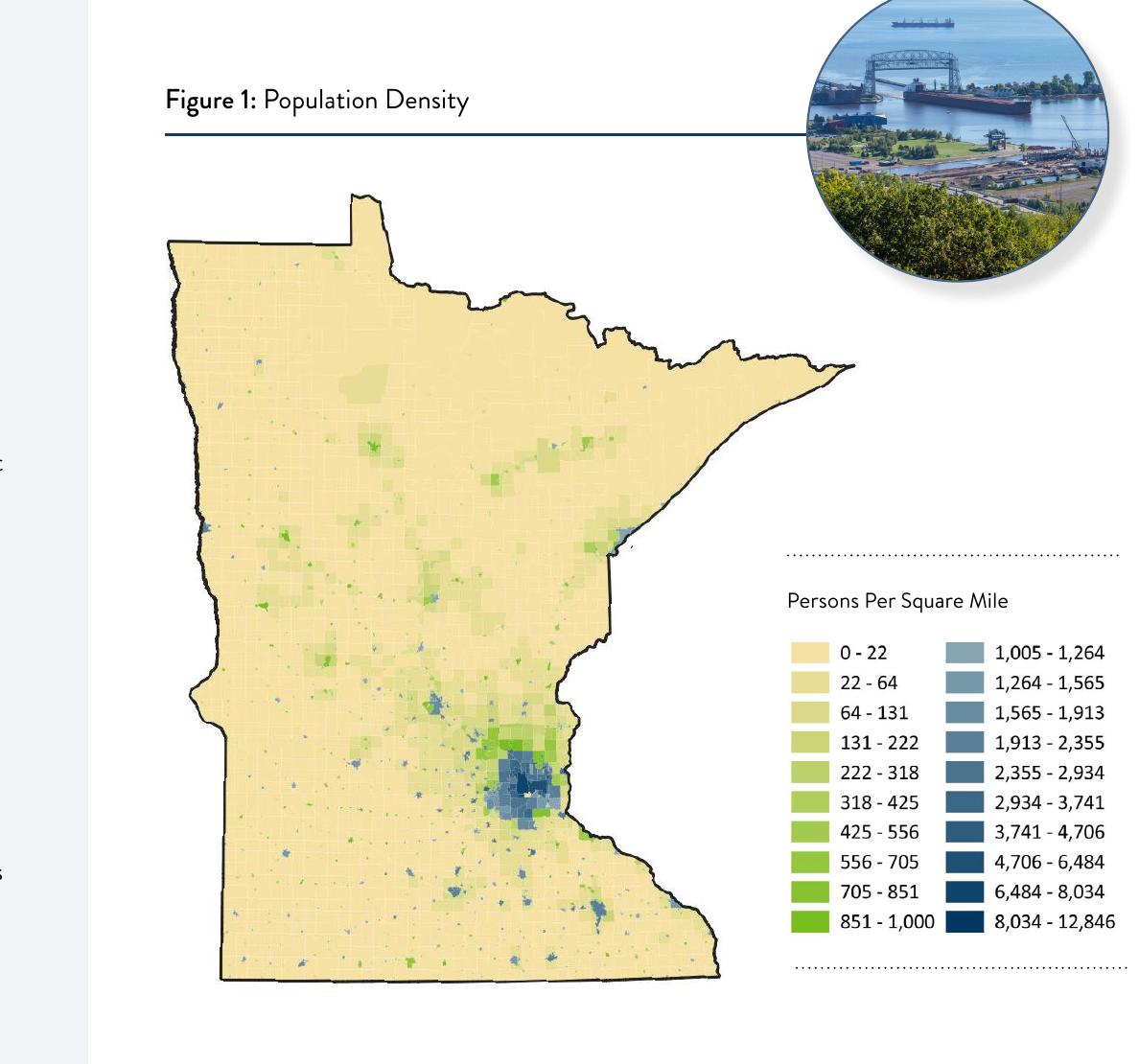
A county boundary is useful for government, but people do not arrange themselves evenly inside counties. This fixed population-density map shows the broad pattern clearly: the Twin Cities dominate, regional centers form smaller knots, and the rural landscape between them is much less densely settled.
Watch the center of gravity tighten
Use the buttons rather than comparing tiny thumbnails. Each map gets the whole stage, and any map can be enlarged again with one click.
Where growth is moving now
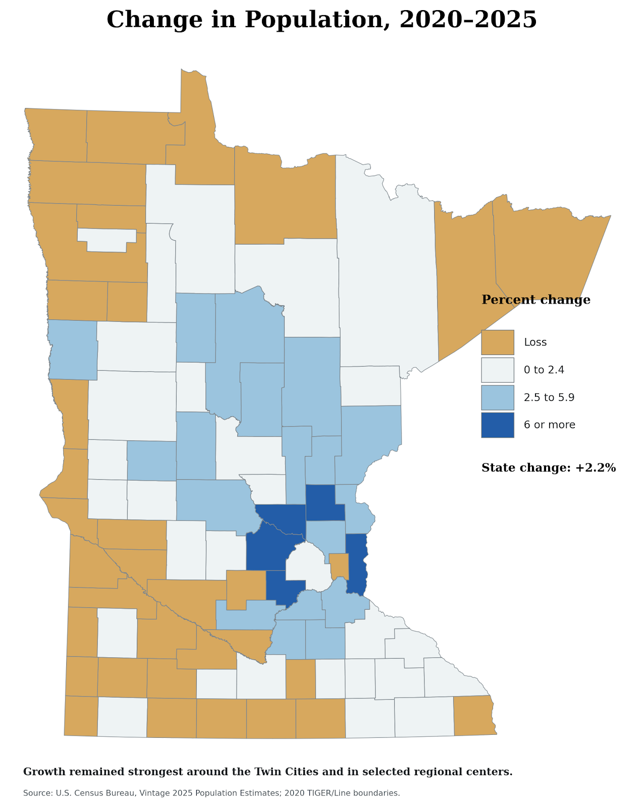
A historical map shows where people were; a change map asks which places are gaining or losing population now. The pattern below keeps the Twin Cities important, but it also separates faster-growing outer metropolitan counties and selected regional centers from counties that have recently lost population.
People do not distribute themselves randomly
Dot-density maps let us ask a different question from county percentages. Instead of coloring an entire county, they show the approximate locations of individual people. The metropolitan pattern becomes much sharper, but so do smaller cities, reservations, and other concentrations that disappear in a county average.
Hold Minnesota still. Change who the dots represent.
These fixed maps are based mainly on the 2020 Census and 2021 American Community Survey. They are not meant to rank groups; they reveal how different settlement histories produce different spatial patterns.
Scale changes the story
One of the most useful habits in geography is to change scale. A county average can make a place look uniform even when its cities and townships are very different. The next four map pairs let you switch between census tracts and counties and watch information appear or disappear.
Where is Minnesota younger, and where is it aging?
Census tracts reveal younger urban and college-centered places that can disappear inside an older county average.
Universities leave spatial fingerprints too
At tract scale, higher educational attainment appears around the Twin Cities and regional university centers. County aggregation smooths much of that difference away.
The metro pattern returns, but not alone
The highest household incomes cluster strongly in the seven-county metropolitan region, while Rochester provides one conspicuous regional exception. At tract scale, the pattern becomes much more intricate.
Poverty is neither purely urban nor purely rural
Tract-level maps reveal pockets that county averages can blur. College towns can also look unusually poor because student cash income does not tell the whole story.
Zoom in: migration inside the Twin Cities
Statewide maps are only the beginning. Hennepin and Ramsey Counties contain many different settlement patterns inside a small metropolitan space. These maps are intentionally shown one at a time so the neighborhoods are actually readable.
Three communities, three urban geographies
Three patterns to keep looking for
Quick map check
Sources and map notes
Historical population maps, rebuilt September 22, 2026: U.S. Census Bureau, Bulletin 359, Population: Minnesota. Composition and Characteristics of the Population, Table I (1910), and 1990 Census of Population and Housing: Population and Housing Unit Counts, Minnesota, CPH-2-25, Table 3, printed pages 3–4 (1960 and 1990). All county counts sum to the published state totals: 2,075,708; 3,413,864; and 4,375,099. Census counts are historical evidence, not current estimates.
How the historical maps were drawn: Counts are joined to the U.S. county reference polygons distributed with Basemap, projected in NAD83 / UTM zone 15N and generalized for statewide display. The 1910 map combines the Lake of the Woods area with Beltrami County, as the later county did not yet exist. Other small historical boundary differences are not reconstructed. Henn. and Ram. abbreviate Hennepin and Ramsey; Wash. abbreviates Washington. The seven identical color classes map county totals, not people per square mile. These are new teaching maps, not replicas of the unavailable MnGeo originals.
State demographic maps: Minnesota State Demographic Center, Characteristic Distributions of the Population in Minnesota, using 2020 Census and 2021 ACS data for the fixed population, race/ethnicity, age, education, income, and poverty maps. The original Blogger-hosted images and their legends are retained.
Modern population-change map: U.S. Census Bureau, Vintage 2025 Population Estimates and 2020 TIGER/Line county boundaries. This is a separate official estimate series from the Minnesota State Demographic Center snapshot used near the top of the reading; small differences between estimate programs are expected.
Twin Cities settlement maps: Peter M. Grund, 2025, using the 2020 Census Detailed Demographic and Housing Characteristics File A. Hmong, Somali, and Mexican population maps are licensed CC BY-SA 4.0. Map artwork is unchanged; direct image addresses replace the redirect addresses. They show the numbers identifying with each group per tract, not migration flows or shares of the tract population.
Current statewide snapshot: Minnesota State Demographic Center 2025 estimates, released in 2026. These are separate from the historical maps and the 2020/2021 demographic panels.
Historical county counts used in the three maps
Use this table to check a county without relying on its color. A dash means the county was not separately reported for that year. The Lake of the Woods area is included in the 1910 Beltrami count, so Beltrami's three values do not all represent the same boundary.
| County | 1910 | 1960 | 1990 |
|---|---|---|---|
| Aitkin | 10,371 | 12,162 | 12,425 |
| Anoka | 12,493 | 85,916 | 243,641 |
| Becker | 18,840 | 23,959 | 27,881 |
| Beltrami | 19,337 | 23,425 | 34,384 |
| Benton | 11,615 | 17,287 | 30,185 |
| Big Stone | 9,367 | 8,954 | 6,285 |
| Blue Earth | 29,337 | 44,385 | 54,044 |
| Brown | 20,134 | 27,676 | 26,984 |
| Carlton | 17,559 | 27,932 | 29,259 |
| Carver | 17,455 | 21,358 | 47,915 |
| Cass | 11,620 | 16,720 | 21,791 |
| Chippewa | 13,458 | 16,320 | 13,228 |
| Chisago | 13,537 | 13,419 | 30,521 |
| Clay | 19,640 | 39,080 | 50,422 |
| Clearwater | 6,870 | 8,864 | 8,309 |
| Cook | 1,336 | 3,377 | 3,868 |
| Cottonwood | 12,651 | 16,166 | 12,694 |
| Crow Wing | 16,861 | 32,134 | 44,249 |
| Dakota | 25,171 | 78,303 | 275,227 |
| Dodge | 12,094 | 13,259 | 15,731 |
| Douglas | 17,669 | 21,313 | 28,674 |
| Faribault | 19,949 | 23,685 | 16,937 |
| Fillmore | 25,680 | 23,768 | 20,777 |
| Freeborn | 22,282 | 37,891 | 33,060 |
| Goodhue | 31,637 | 33,035 | 40,690 |
| Grant | 9,114 | 8,870 | 6,246 |
| Hennepin | 333,480 | 842,854 | 1,032,431 |
| Houston | 14,297 | 16,588 | 18,497 |
| Hubbard | 9,831 | 9,962 | 14,939 |
| Isanti | 12,615 | 13,530 | 25,921 |
| Itasca | 17,208 | 38,006 | 40,863 |
| Jackson | 14,491 | 15,501 | 11,677 |
| Kanabec | 6,461 | 9,007 | 12,802 |
| Kandiyohi | 18,969 | 29,987 | 38,761 |
| Kittson | 9,669 | 8,343 | 5,767 |
| Koochiching | 6,431 | 18,190 | 16,299 |
| Lac qui Parle | 15,435 | 13,330 | 8,924 |
| Lake | 8,011 | 13,702 | 10,415 |
| Lake of the Woods | — | 4,304 | 4,076 |
| Le Sueur | 18,609 | 19,906 | 23,239 |
| Lincoln | 9,874 | 9,651 | 6,890 |
| Lyon | 15,722 | 22,655 | 24,789 |
| McLeod | 18,691 | 24,401 | 32,030 |
| Mahnomen | 3,249 | 6,341 | 5,044 |
| Marshall | 16,338 | 14,262 | 10,993 |
| Martin | 17,518 | 26,986 | 22,914 |
| Meeker | 17,022 | 18,887 | 20,846 |
| Mille Lacs | 10,705 | 14,560 | 18,670 |
| Morrison | 24,053 | 26,641 | 29,604 |
| Mower | 22,640 | 48,498 | 37,385 |
| Murray | 11,755 | 14,743 | 9,660 |
| Nicollet | 14,125 | 23,196 | 28,076 |
| Nobles | 15,210 | 23,365 | 20,098 |
| Norman | 13,446 | 11,253 | 7,975 |
| Olmsted | 22,497 | 65,532 | 106,470 |
| Otter Tail | 46,036 | 48,960 | 50,714 |
| Pennington | 9,376 | 12,468 | 13,306 |
| Pine | 15,878 | 17,004 | 21,264 |
| Pipestone | 9,553 | 13,605 | 10,491 |
| Polk | 36,001 | 36,182 | 32,498 |
| Pope | 12,746 | 11,914 | 10,745 |
| Ramsey | 223,675 | 422,525 | 485,765 |
| Red Lake | 6,564 | 5,830 | 4,525 |
| Redwood | 18,425 | 21,718 | 17,254 |
| Renville | 23,123 | 23,249 | 17,673 |
| Rice | 25,911 | 38,988 | 49,183 |
| Rock | 10,222 | 11,864 | 9,806 |
| Roseau | 11,338 | 12,154 | 15,026 |
| St. Louis | 163,274 | 231,588 | 198,213 |
| Scott | 14,888 | 21,909 | 57,846 |
| Sherburne | 8,136 | 12,861 | 41,945 |
| Sibley | 15,540 | 16,228 | 14,366 |
| Stearns | 47,733 | 80,345 | 118,791 |
| Steele | 16,146 | 25,029 | 30,729 |
| Stevens | 8,293 | 11,262 | 10,634 |
| Swift | 12,949 | 14,936 | 10,724 |
| Todd | 23,407 | 23,119 | 23,363 |
| Traverse | 8,049 | 7,503 | 4,463 |
| Wabasha | 18,554 | 17,007 | 19,744 |
| Wadena | 8,652 | 12,199 | 13,154 |
| Waseca | 13,466 | 16,041 | 18,079 |
| Washington | 26,013 | 52,432 | 145,896 |
| Watonwan | 11,382 | 14,460 | 11,682 |
| Wilkin | 9,063 | 10,650 | 7,516 |
| Winona | 33,398 | 40,937 | 47,828 |
| Wright | 28,082 | 29,935 | 68,710 |
| Yellow Medicine | 15,406 | 15,523 | 11,684 |